Industry
Healthcare
Client
Anooka Healthcare
Service
iOS App Design
Date
March 2021- April 2024


Patient Research
iOS App Deisgn
HiFi Deisgns
Wireframing
User Testing
Style Guide
Site Map
User Flows

This is a service to allow pstients to communicate with physical therapist and learn how maintain their excersize routine.
Patients were having trouble viewing and understandng some of the workouts and confused on how to use the chat system.

The goal was to ensure patients had a positive experience using the application and able to navigate where they need to within the app. The focus for this project was the chat feature.
To ensure the product met both patient needs and clinical expectations, we conducted mixed-method research focused on understanding pain points, communication gaps, and user behaviors.
Key Research Objectives
Understand how patients currently communicate with their physical therapists
Identify barriers to consistent follow-up or recovery tracking
Explore therapist pain points when managing multiple patient communications
Validate the need for features like chat, appointment reminders, and progress tracking
User Interviews (8 total):
5 patients recovering from injury or post-surgical care
3 licensed physical therapists working in outpatient clinics
Surveys (36 responses):
Distributed via Google Forms to physical therapy patients in California
Focused on communication habits, challenges, and technology preferences
Competitive Analysis:
Reviewed 5 health/wellness communication apps (including MyChart and SimplePractice)
Focused on usability, HIPAA compliance, and patient-to-provider chat features
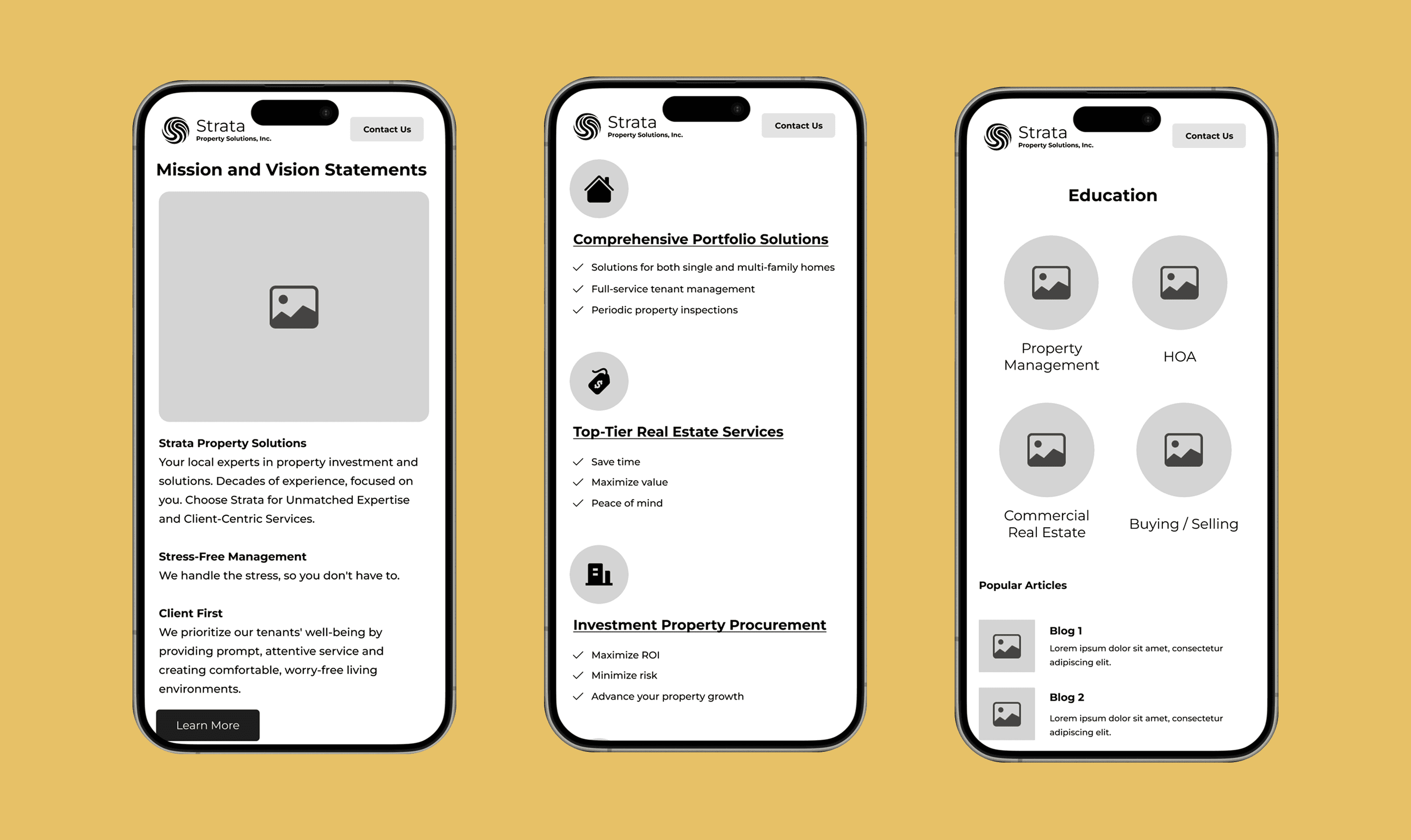
We need to understand where users were trying to go. Learning about this requires me to do some learning about the user.
Do they want to learn more information about the service?
Do they want to go directly into contacting the business?
Are they a qualified customer to be using the service?

We are now in a position to delve further into crafting content for each page, derived from user research and competitive research. My aim was to concentrate on the lead page, which is the homepage, to gauge the reusable content for the remaining pages.
It was important to have a UI that represented profession and also trust. Having an ocean them design also helped fortify the design thinking of this project.